| 类别 | 内容导航 |
|---|
| 机器学习 | 机器学习算法应用场景与评价指标 |
| 机器学习算法—分类 |
| 机器学习算法—回归 |
| 机器学习算法—聚类 |
| 机器学习算法—异常检测 |
| 机器学习算法—时间序列 |
| 数据可视化 | 数据可视化—折线图 |
| 数据可视化—箱线图 |
| 数据可视化—柱状图 |
| 数据可视化—饼图、环形图、雷达图 |
| 统计学检验 | 箱线图筛选异常值 |
| 3 Sigma原则筛选离群值 |
| Python统计学检验 |
| 大数据 | PySpark大数据处理详细教程 |
| 使用教程 | CentOS服务器搭建Miniconda环境 |
| Linux服务器配置免密SSH |
| 大数据集群缓存清理 |
| 面试题整理 | 面试题—机器学习算法 |
| 面试题—推荐系统 |
import matplotlib.pyplot as plt
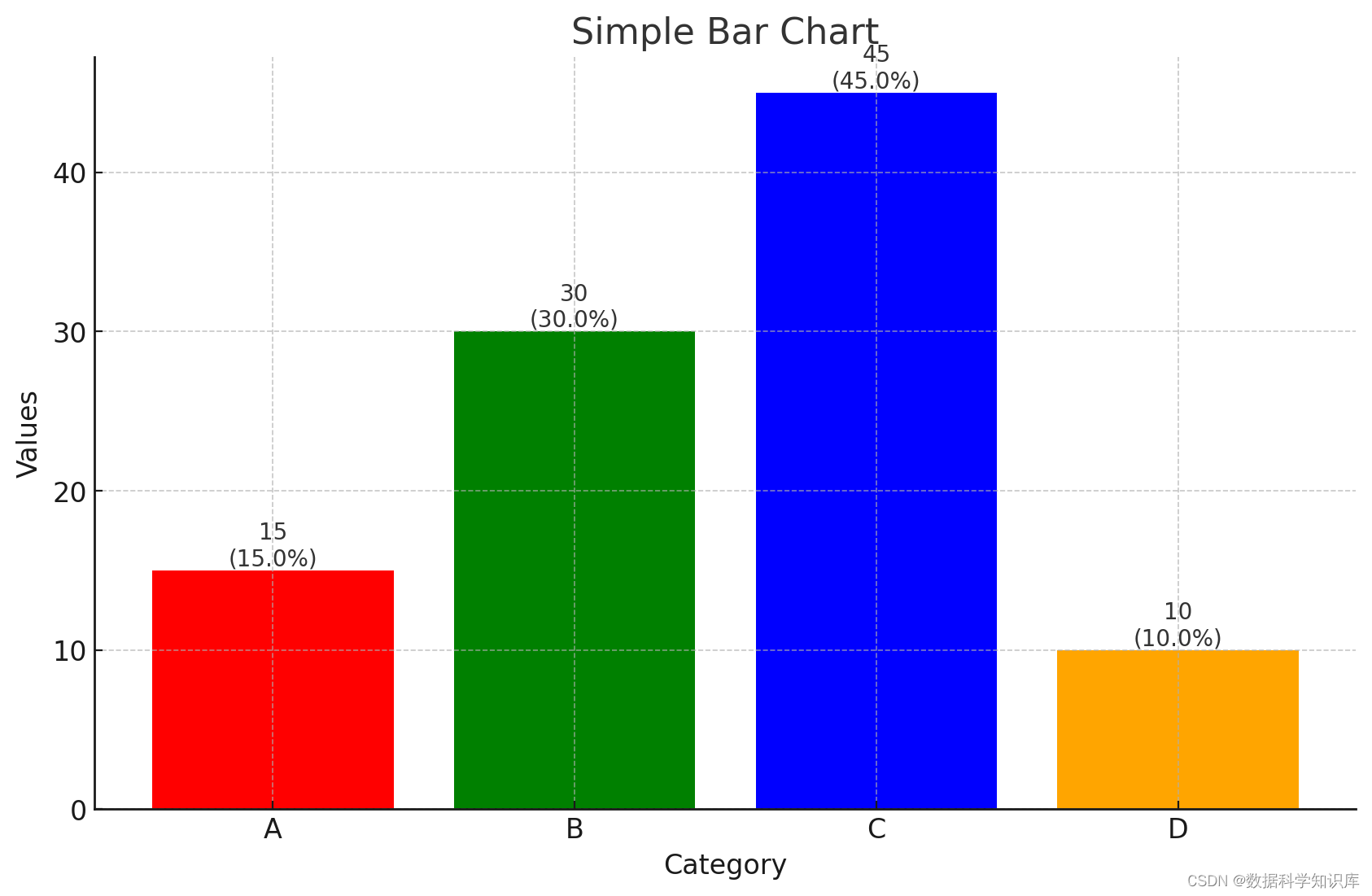
import numpy as npdef plot_bar_chart(data, labels, colors=None, title="Bar Chart", xlabel="X-Axis", ylabel="Y-Axis"):"""绘制柱状图,并在柱子上显示数量和比例。:param data: 包含数值的列表。:param labels: 与数据相对应的标签列表。:param colors: 柱子的颜色列表。:param title: 图表的标题。:param xlabel: X轴的标签。:param ylabel: Y轴的标签。"""fig, ax = plt.subplots()bars = plt.bar(labels, data, color=colors)total = sum(data)for bar in bars:yval = bar.get_height()plt.text(bar.get_x() + bar.get_width()/2, yval, f'{yval}\n({yval/total:.1%})', ha='center', va='bottom')plt.title(title)plt.xlabel(xlabel)plt.ylabel(ylabel)plt.show()# 示例数据
simple_data = [15, 30, 45, 10]
simple_labels = ['A', 'B', 'C', 'D']
simple_colors = ['red', 'green', 'blue', 'orange']
grouped_data = [[12, 30, 1, 8], [28, 6, 16, 5]]
group_labels = ['Group 1', 'Group 2', 'Group 3', 'Group 4']
category_labels = ['Category A', 'Category B']
# 绘制图表
plot_bar_chart(simple_data, simple_labels, simple_colors, title="Simple Bar Chart", xlabel="Category",ylabel="Values")
import matplotlib.pyplot as plt
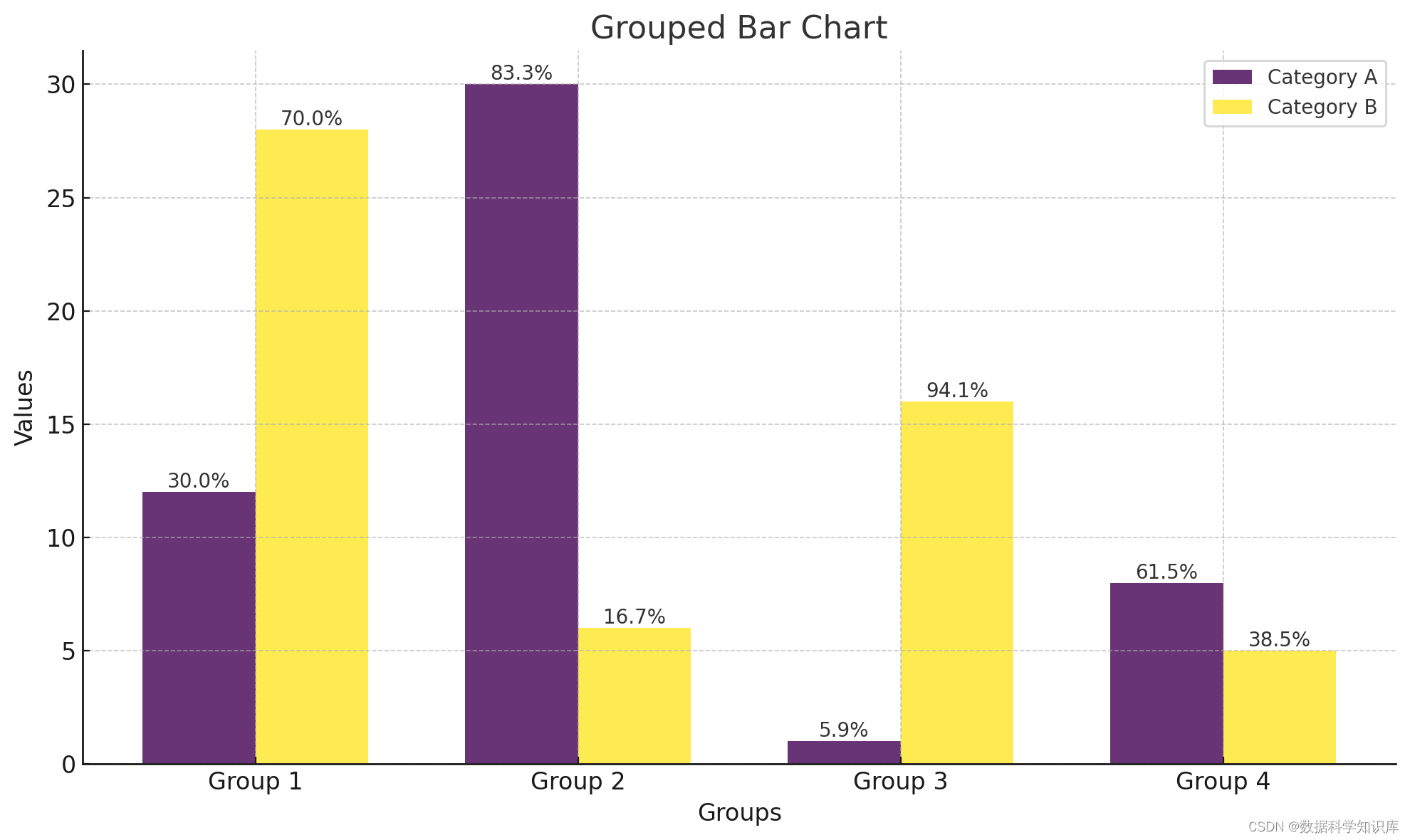
import numpy as npdef plot_grouped_bar_chart(data, group_labels, category_labels, colors=None, title="Grouped Bar Chart", xlabel="X-Axis", ylabel="Y-Axis"):"""绘制分组柱状图,并在柱子上显示数量和比例。:param data: 一个二维列表,其中每个内部列表包含同一组的数据。:param group_labels: 每组的标签列表。:param category_labels: 类别标签列表。:param colors: 每个类别的柱子颜色列表。:param title: 图表的标题。:param xlabel: X轴的标签。:param ylabel: Y轴的标签。"""n_groups = len(data[0])n_categories = len(data)fig, ax = plt.subplots()index = np.arange(n_groups)bar_width = 0.35opacity = 0.8if not colors or len(colors) != n_categories:colors = plt.cm.viridis(np.linspace(0, 1, n_categories))total = np.sum(data, axis=0)for i in range(n_categories):bars = plt.bar(index + i * bar_width, data[i], bar_width, alpha=opacity, color=colors[i], label=category_labels[i])for bar, total_val in zip(bars, total):yval = bar.get_height()plt.text(bar.get_x() + bar.get_width()/2, yval, f'{yval/total_val:.1%}', ha='center', va='bottom')plt.title(title)plt.xlabel(xlabel)plt.ylabel(ylabel)plt.xticks(index + bar_width / 2, group_labels)plt.legend()plt.tight_layout()plt.show()# 示例数据
grouped_data = [[12, 30, 1, 8], [28, 6, 16, 5]]
group_labels = ['Group 1', 'Group 2', 'Group 3', 'Group 4']
category_labels = ['Category A', 'Category B'] # 绘制图表
plot_grouped_bar_chart(grouped_data, group_labels, category_labels, title="Grouped Bar Chart", xlabel="Groups",ylabel="Values")